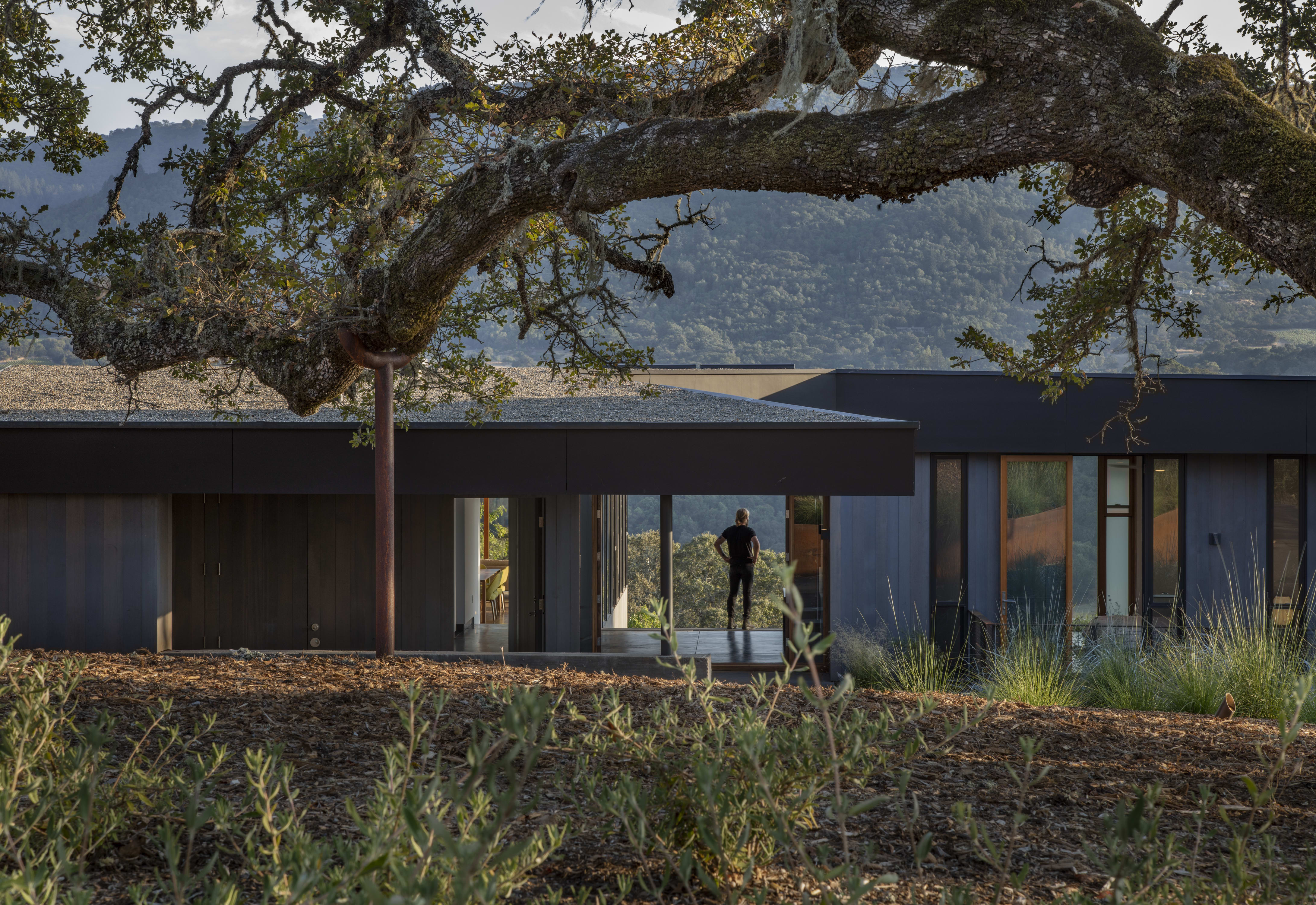
Paradox House
“How wonderful that we have met with a paradox. Now we have some hope of making progress.” ― Niels Bohr
It might have been tempting to gloss over the inherent tensions in the logically incompatible impulses of our two clients for the design of their new Sonoma home, and to deny the multitude of conflicting technical requirements for this complex site. Yet, the Paradox House attempts to find fodder in the creative power of paradoxical thinking.

Perhaps inspired by the incongruity of designing a family home –a highly personal endeavor– in a pandemic over Zoom, or the recognition of the freedom that comes from embracing the often-somber paradoxes of life and work that came out of these times, the home is a model for ‘both-and’ thinking in the face of what appear to be ‘either-or’ options.
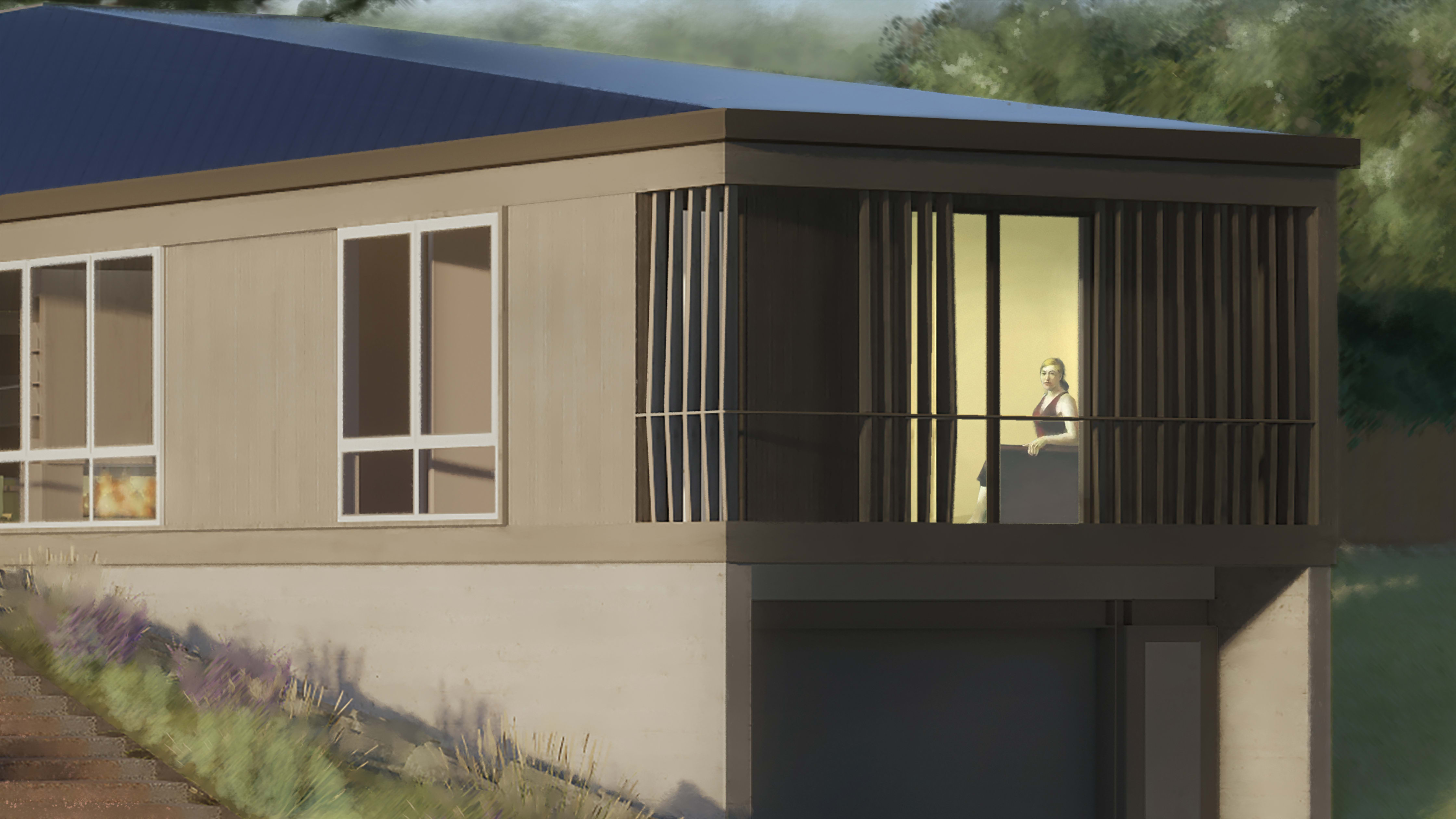

The clients are a wonderful paradox as a couple: one raised in Iran and the other in South Africa; one more fiery, one cooler; one drawn to order, the other to serendipity; one operating in shades of grey, the other in bold colors.
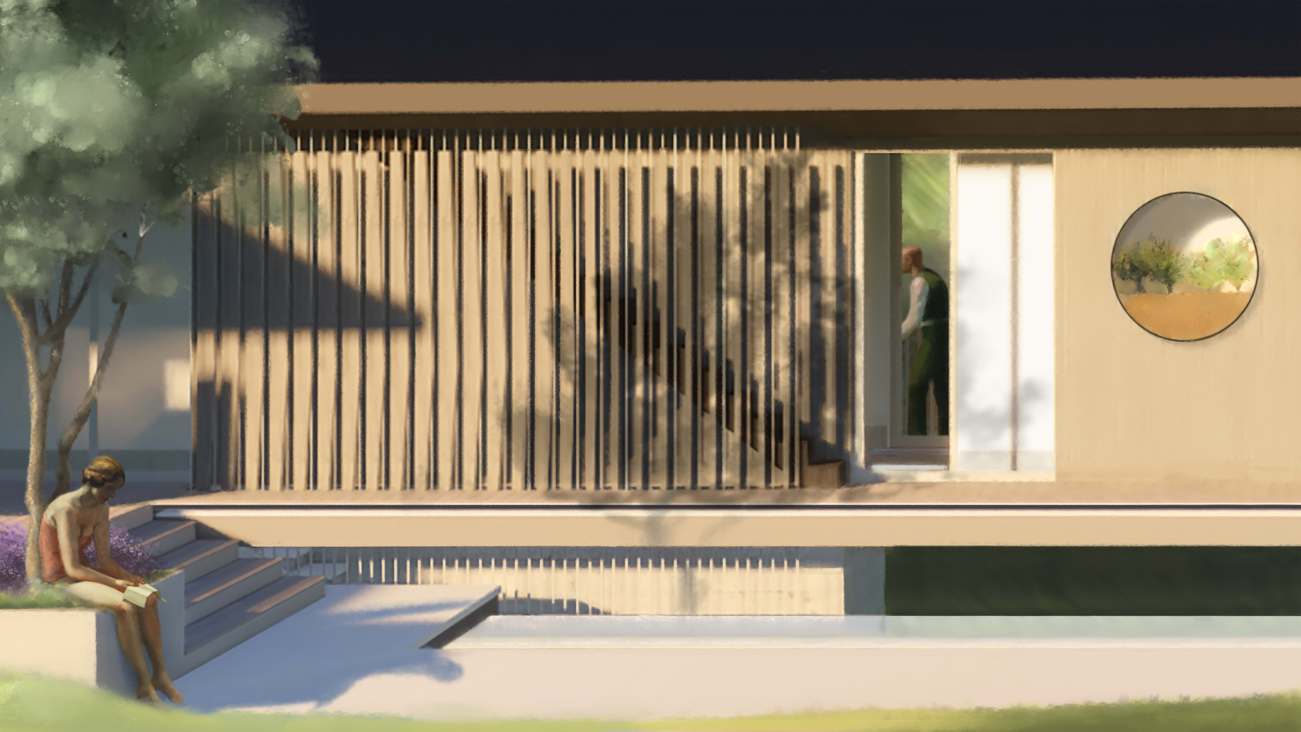

Out of this fascinating dialectic came diametrically opposed intuitions for the siting of the home: one wanting a multistory structure high above the ground to capture mountain views, the other gravitating towards a single-story design firmly grounded in the landscape. One client’s priority was just a bit of lawn and a pool the family could plunge directly into from their bedrooms, while the other’s was meandering paths through smaller gardens and outdoor spaces.


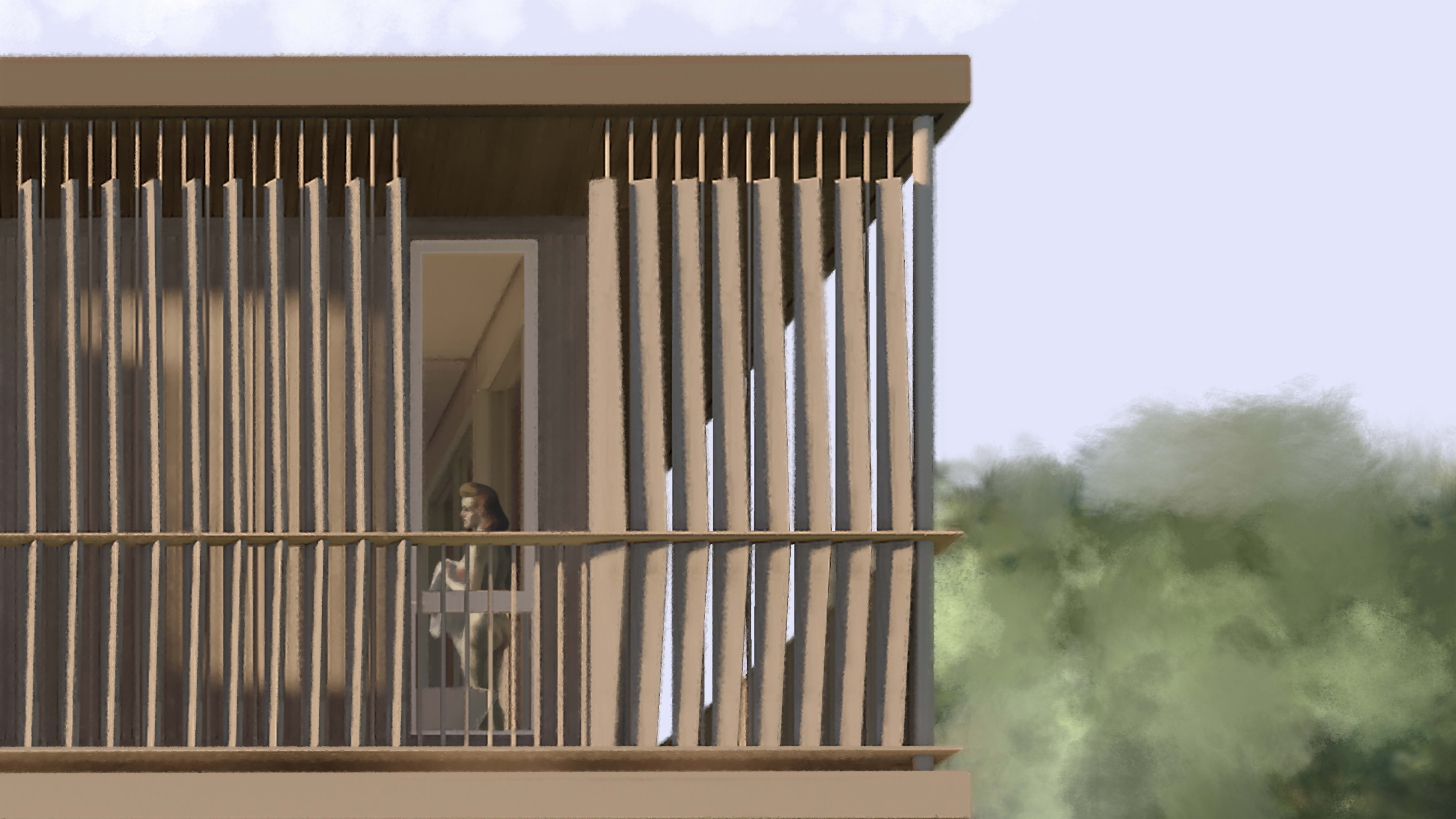
Paradoxical thinking became the leitmotif for the both the design and the design process. For example, an entry folly holds a geode ‘garden’ under a curious skylight –an outer wood-lined opening with soft baffled light holds an inner hanging volume with sharply-focused light, intensified with vibrant color.
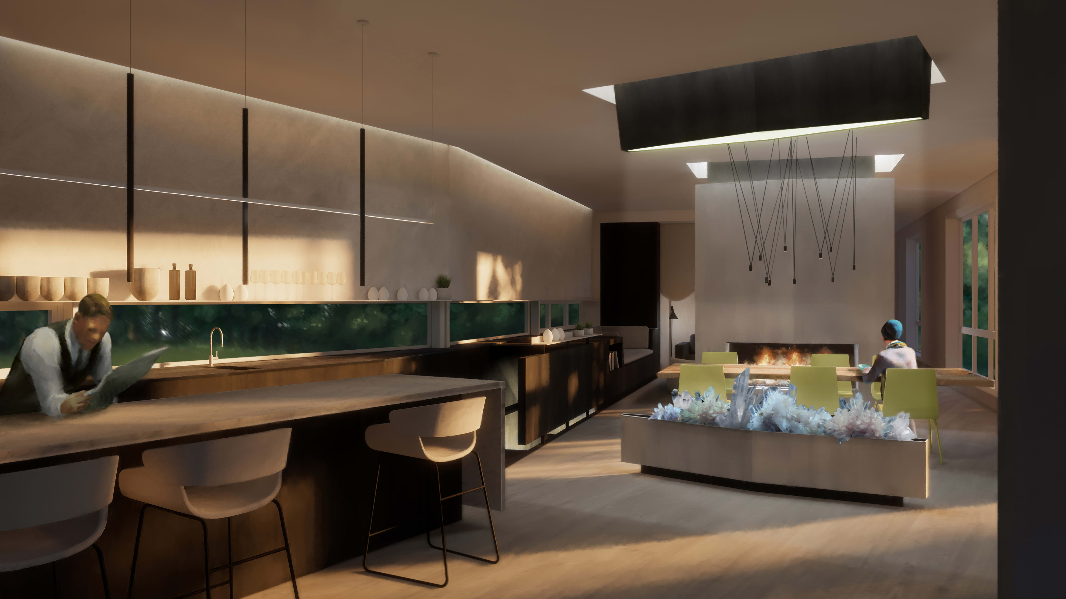
This morning ‘earth and sky’ entry piece pairs with an evening ‘fire and ice’ room divider, uniting the client’s opposing desires –glows of a gas flame from below, a skylit art niche above, and the light-emitting diodes of a hidden media center on the backside.
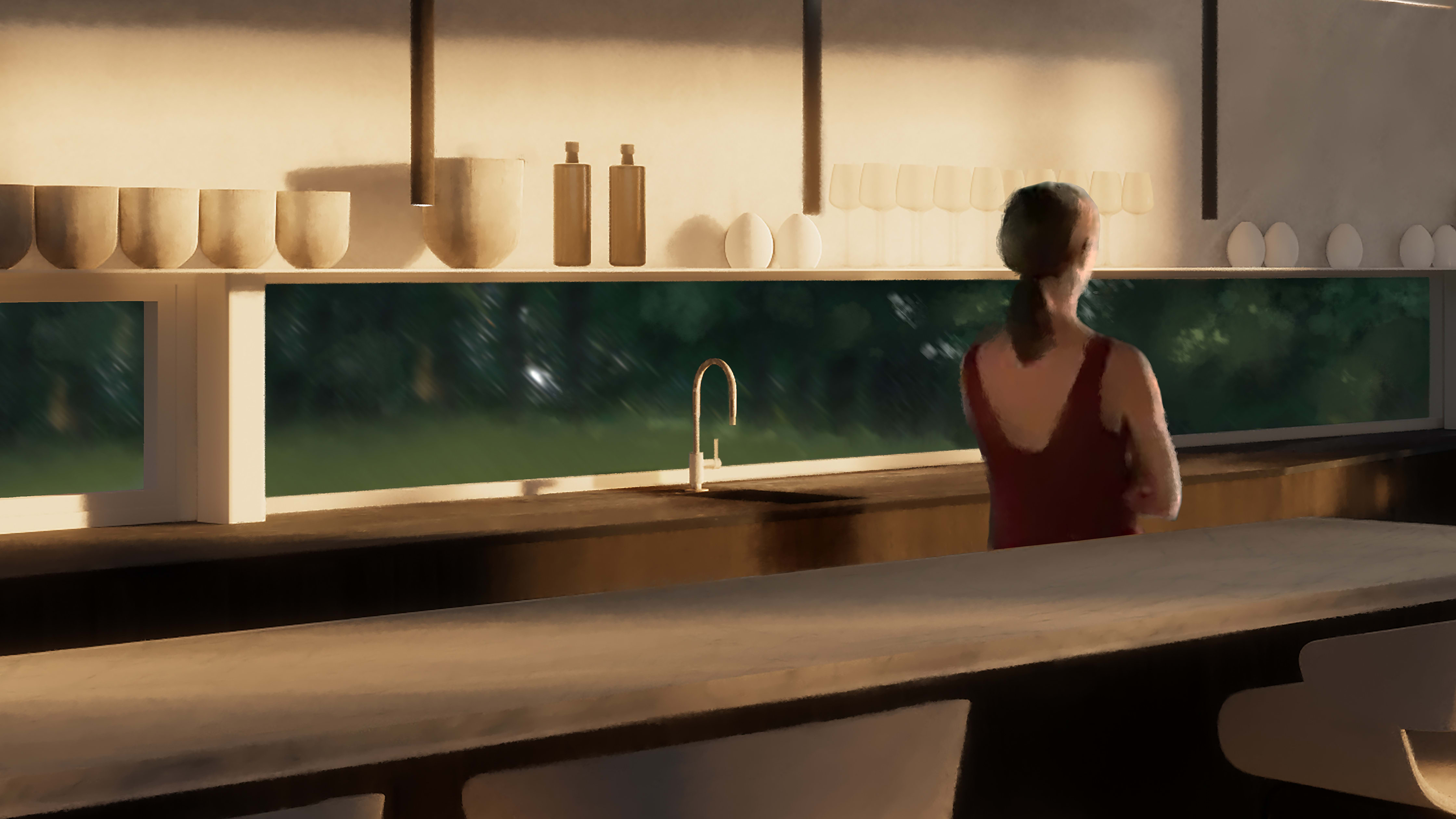
Given the siting and orientation, the home comes most alive in the extremes of the long shadows of early morning and late afternoon. To nurture the impact of these ephemeral moments on our clients, we reimagined figures from the American painter Edward Hopper, inserting them as the home’s new occupants. Why?
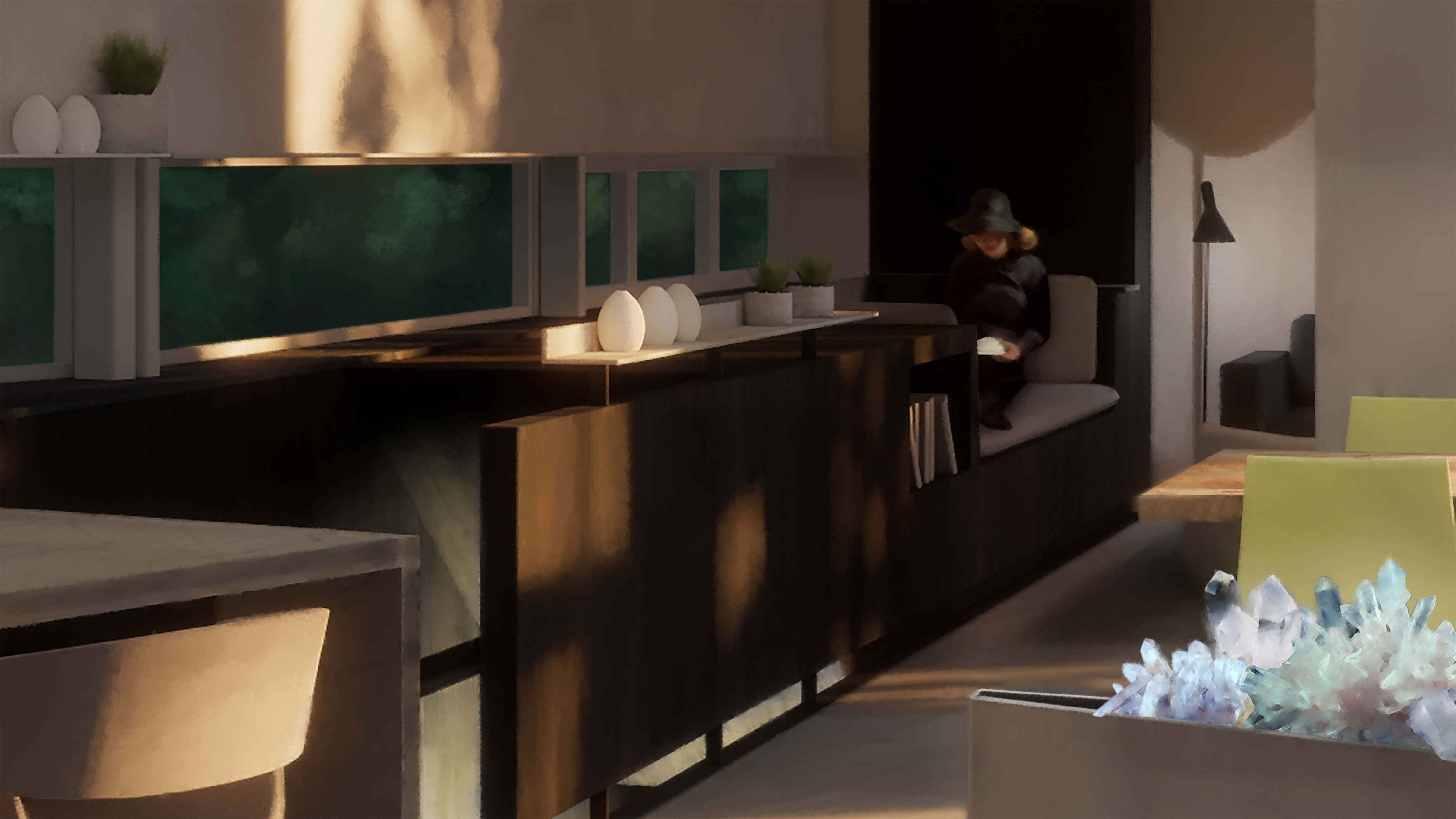
Hopper was known equally for his ‘portraits’ of classic American architecture sitting alone in rugged landscapes, as well as his post-war melancholic take on life in the city, with people alone in spaces –but more pointedly, alone in crowds. The tension in these spaces among inhabitant, architecture, light, and landscape seems an apt approach to a building, home, and life filled with the richness of paradox.


